FINAL video


<p><a href=”https://vimeo.com/305133824″>DINNER DATE FINAL</a> from <a href=”https://vimeo.com/user91919839″>Bridget Lin</a> on <a href=”https://vimeo.com”>Vimeo</a&gt;.</p>


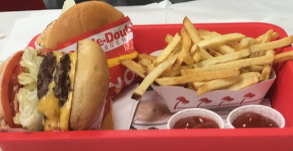
With my food choices, I chose to eat at one of my favorite restaurants, Olive Garden.  It has some of the best food choices, a lot of people enjoy it and it is decently priced for the amount of food that is given to you. It is definitely one of my favorite places to just have a nice dinner date at.

My video is introduced through the process of what happens there when I get my food and what I do. It is a slow walk through most of what I eat and what I like to get. It transitions through different scenes with getting the menu, flipping through it, reading it, getting the food, mixing up the salad and all sorts of fun things.

I also ended up getting my voice over it and it introduces and tells what is going on and how I feel about it. I really enjoy doing it and tried to balance out the noise of the video to my voice. I was really excited to do this part because putting it together and making it come together was actually really fun. Some suggestions included were adding some of those things and I really liked how it ended up turning out. As well as that, another suggestion was also getting different kinds of footage and taking them all from the same view. However, I was not able to accomplish that this time but I will keep that part in mind.

The jazz music was how everything came together and fulfills the empty parts where I don’t talk. Because I didn’t want to talk the entire time, having jazz music in the background was actually really nice and so people could just watch the video since, at the time being, it filled up enough space and told the story enough. I still believe that jazz music really brightens up and goes with food because it has this calm sort of tone that isn’t too boring but isn’t too upbeat as well. Hopefully, everything together sounds good enough and people understand what is going on at the time being.

draft video story


<p><a href=”https://vimeo.com/303805420″>DINNER DATE</a> from <a href=”https://vimeo.com/user91919839″>Bridget Lin</a> on <a href=”https://vimeo.com”>Vimeo</a&gt;.</p>

For my video, I decided to do a dinner date at Olive Garden and what I usually get from there with my boyfriend. It was a small and short one minute video, combined of the food that comes, what’s on the menu and the specials for the time being. Olive garden, being one of my favorite places to eat at, defintely has my favorite foods there and also having high quality foods there.

I did the video based on the order that people usually would eat in. They would start off by looking off the menu, getting their drinks, ordering their food and eventually getting their food at the end. I also put the same video of getting the water at the end, as usually when something finishes, it repeats itself at the end. I also had different videos from different angles and one video being between another so it would show a different angle and perspective. I think this makes it look better, as well as making it look more involved.

I once again, put jazz music with the video because I really like how jazz music vibes with food. I lowered the sound of the video so the music could be heard better and since this is just a draft, I haven’t fully figured out how I wanted my voice and my introduction into the vide, which is coming soon. I think it will mostly just be me narrating what is going on and happening around in the video. I think I might also make the overall video bright since in Olive Garden, is it kind of dark and I think food should be associated with bright colors. I do wish maybe I got more B roll and film, so things could be easier to add on or maybe some other pictures that would make the whole video flow better and longer.

Raw footage


<p><a href=”https://vimeo.com/303194711″>IMG_4261</a&gt; from <a href=”https://vimeo.com/user91919839″>Bridget Lin</a> on <a href=”https://vimeo.com”>Vimeo</a&gt;.</p>


<p><a href=”https://vimeo.com/303194694″>IMG_4259</a&gt; from <a href=”https://vimeo.com/user91919839″>Bridget Lin</a> on <a href=”https://vimeo.com”>Vimeo</a&gt;.</p>


<p><a href=”https://vimeo.com/303194687″>IMG_4258</a&gt; from <a href=”https://vimeo.com/user91919839″>Bridget Lin</a> on <a href=”https://vimeo.com”>Vimeo</a&gt;.</p>


<p><a href=”https://vimeo.com/303194669″>IMG_4256</a&gt; from <a href=”https://vimeo.com/user91919839″>Bridget Lin</a> on <a href=”https://vimeo.com”>Vimeo</a&gt;.</p>

Final Audio Story


For the Audio story, I mostly did it around a topic that everyone can relate to, which is their favorite foods. I did it for this reason so around the entire interview, it would seem more conversational rather than formal and the people would answer more honestly.

I separated the interviews by how the people would respond in the question order of asking them for their favorite foods, where they get it from and why they like it so much. I made the entire interview more conversational, adding in laughs, adding inside notes and also making them sound better in this sense because that way, it will sound more natural and things will come easier. I took the advice of fulling adding on more noises and trying my best not to cut people off as if was hard because sometimes they would cut themselves off and the whole thing would end there. I also, as advised, turned the music down a little lower so people could hear the interviews better. By adding more of this, it does sound better and sound fuller.

Additionally, I added jazz music because it seemed like it would fit the overall mood for the interviews. While talking or eating food, people have a lot of jazz going on and it actually brightens the mood. I used jazz music from freesound.org and imported into two different kinds of music so there was more variety and the whole thing wouldn’t be playing the same thing over and over again. I used four different interviews as well so there would be more variety in opinions and what people thought would be good for the overall message. Everyone was excited to talk about their favorite foods, because who wouldn’t enjoy sharing a bit of that?

By doing these interviews, I could then see what a small portion of people liked to eat and why they liked to eat it. Then, I could incorporate it into my own website, by getting the foods I know a majority of people liked and it would easier for them to understand where I was coming from with all this. Hopefully, then people could relate to my website and they could also see themselves compared to other people. It was interesting to see and listen to all the different comments made by people and where they wanted to eat. With this, it becomes easier to understand different people and know just what kind of foods they like.

Favorite foods interviews!

With the whole theme of food around my website, I decided to ask around for people’s thoughts on their favorite food and their favorite places to eat, as well as the reasoning behind it. As I’m still getting used to using audition, it becomes interesting to see all the different ways I can work around with it. While adjusting, I would mostly add different clips in as I did four interviews with four different people and their opinion on their favorite foods.

First off, I used Jazz music, as a calming sort of tone and also give it a beat as it goes along. I got it off the website “freesound.com”, which is the same website that gave the chimes sound from earlier projects. Jazz seems to fit the mood and the overall tone as I used it as background music and lowered the volume on it when people are talking. I also used it to fill the empty space, in hopes that it could fill up some room to pause the pauses slightly less awkward. I used the pauses to indicate the different people talking, for I split it up in ways such as first, people saying what they like and then later on why. Of course, in that case, I kept the people in the same order but I also liked the flow of it more. This then leads off to my second point of why I set things up in the way that I did.

Secondly, I had my voice first go in, to give a sort of introduction to the whole deal and what is going on. I told what questions I had asked and I even left my voice with some of the commentaries to make it more friendly and instead of making it seem like an interview, I wanted to make it more conversational. I felt that it made people feel more comfortable listening and talking to me about it instead of having done more professionally. Hopefully, this would work out in some sense, if not I will probably take it off later, considering that this is a draft. I think overall the jazz music completes everything and gives off a good vibe to the overall message of food. After all, in most fancy and nice restaurants, you do hear jazz playing in the background as the music.

https://freesound.org/people/FoolBoyMedia/sounds/347848/ (This is the link I used for the jazz music)

Auditions

Mixdown

https%3A//api.soundcloud.com/playlists/631324572&color=%23ff5500&auto_play=false&hide_related=false&show_comments=true&show_user=true&show_reposts=false&show_teaser=true&visual=true”></iframe>

Questions and answers

https://w.soundcloud.com/player/?url=https%3A//api.soundcloud.com/tracks/520384929&color=%23ff5500&auto_play=false&hide_related=false&show_comments=true&show_user=true&show_reposts=false&show_teaser=true&visual=true”></iframe&gt;

FINAL logo

This is what my logo looks like!

For the most part, it revolves around a blue theme, with colors and fonts that add and build each other up. From earlier, I designed a basic set up with no color because I had not decided quite yet what colors I wanted, but now I realized I like how the color blue goes with the theme of my overall website.

More importantly, around the words, I added bubbles, to give it a happier vibe. Originally, I was going to add some food around it but I could not really decide on which one looked better so I thought, why not add something that would make the whole logo become a little happier, just as the same way food brings people happiness. Before that, at first, I wanted the logo to look more like an ice cream cone, and there was a cone there. After hearing feedback, I realized how strange it made it look and there was no balance to it, it seemed out of place, so I took it off, making it just have a bubble theme.  At first, the “to eat” part was also in a different font, but from feedback, I realized I did want to put emphasis on just one work, so the word “like” is in a different font from the other words.

For the logo, I used the warp tool to create the banner around my name. It puts emphasis around it and brings attention to the beginning of the logo, which was my name. By carefully drawing the lines around and clicking everything together to make sure it all goes alright, it was quite difficult. Secondly, I used the Ellipse tool, to create the small bubbles, first creating a big circle and then secondly creating a small circle inside of it in order to create a sort of reflection in the bubbles. After finding the fonts I liked, I downloaded some other fonts and used those to be able to give it a different look from all the other regular fonts.

The logo overall creates a sense of happiness, giving people an idea of what this website is about. It shows how blue, is used as a happy color and how people see things on the website. After all, while eating together and seeing desserts should make people nothing but happy.

logo draft

This would be my logo for the website. Based on this, this would include the website name and my name on it included. Bridget would be in the banner as it includes me and a funky font I enjoy. The circles around it are made from the eclipse tool and used to be seen as bubbles. Overall, I have not exactly chosen a color for the logo because I am trying to find a color that would work together with all the different kinds of food and something that would represent the overall picture.

The bubbles created a kind of show and circle around the overall title. They make it seem “bubbly” as if the title is more fun than expected. Each line has a different font and is used as something that would catch the audience’s eyes more and balance everything out more. If everything was the same, people wouldn’t pay attention as much, as the difference in each font also represents how there are different varieties of food and different things can be fun in different ways.

Underneath the logo, there is a sort of triangle shape, which was something I tried to resemble of a cone, to make it seem like the entire logo is an ice cream kind of shape and the cone is carrying it all. I haven’t fully decided how I want the entire thing to look but I might add a few more things to the cone and the overall logo of the “ice cream”  to try and give it a better vibe. Maybe I would end up just having the cone be brown and everything else on the ice cream to be more colorful, such as with the different fonts and the different “toppings” like the bubbles. I didn’t really have much for the inspiration, it was more doodling going on while I was sketching and looking through my bullet journal to see what designs would work for the overall product. It was quite easy since everything was so easily used and put into work. I wanted to add an overall half circle on the entire thing but I wasn’t fully sure whether I wanted that as the ice cream or I wanted more toppings to represent the ice cream.

I think the name is quite catchy as well and it gives the audience a perfect representation of what topics I want to reach for my website and how I want to be able to reach it in such a way. Hopefully, it would be easily understood and people can get to see where I am coming from with this.